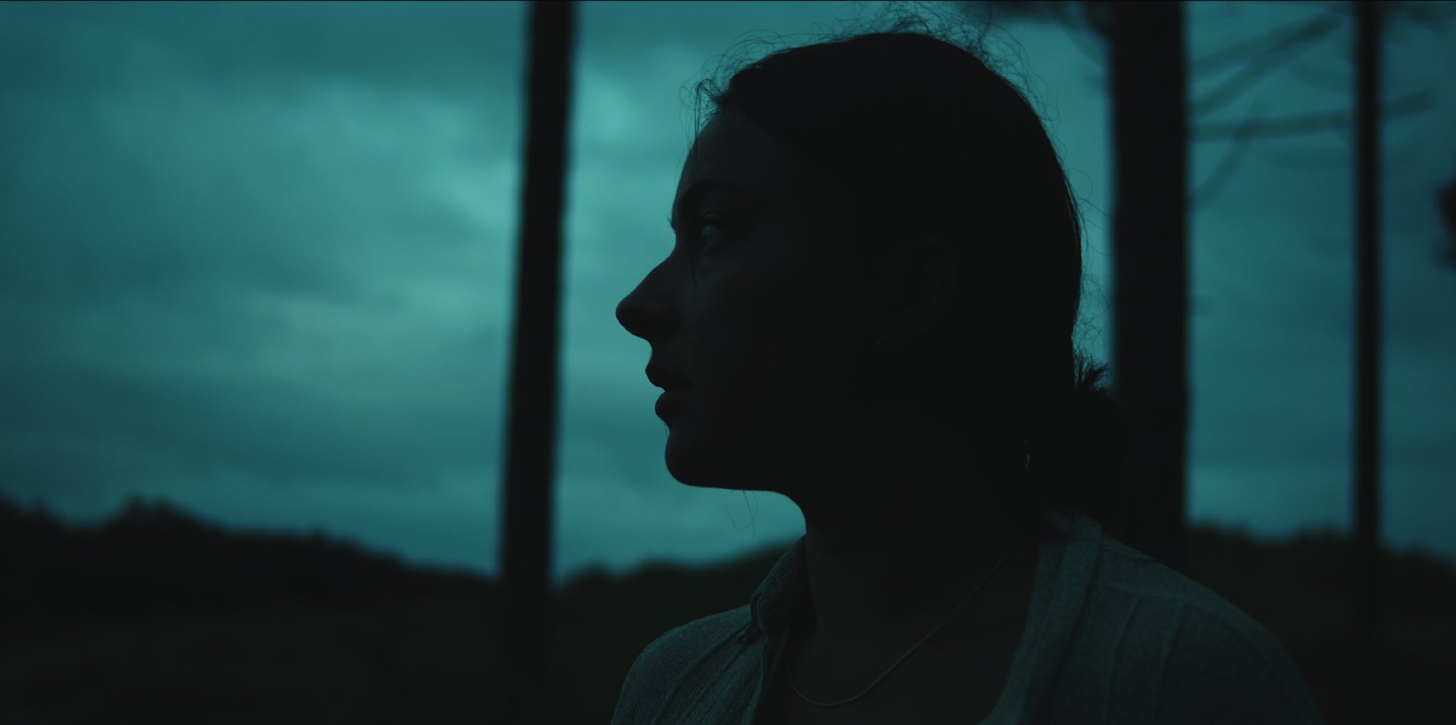
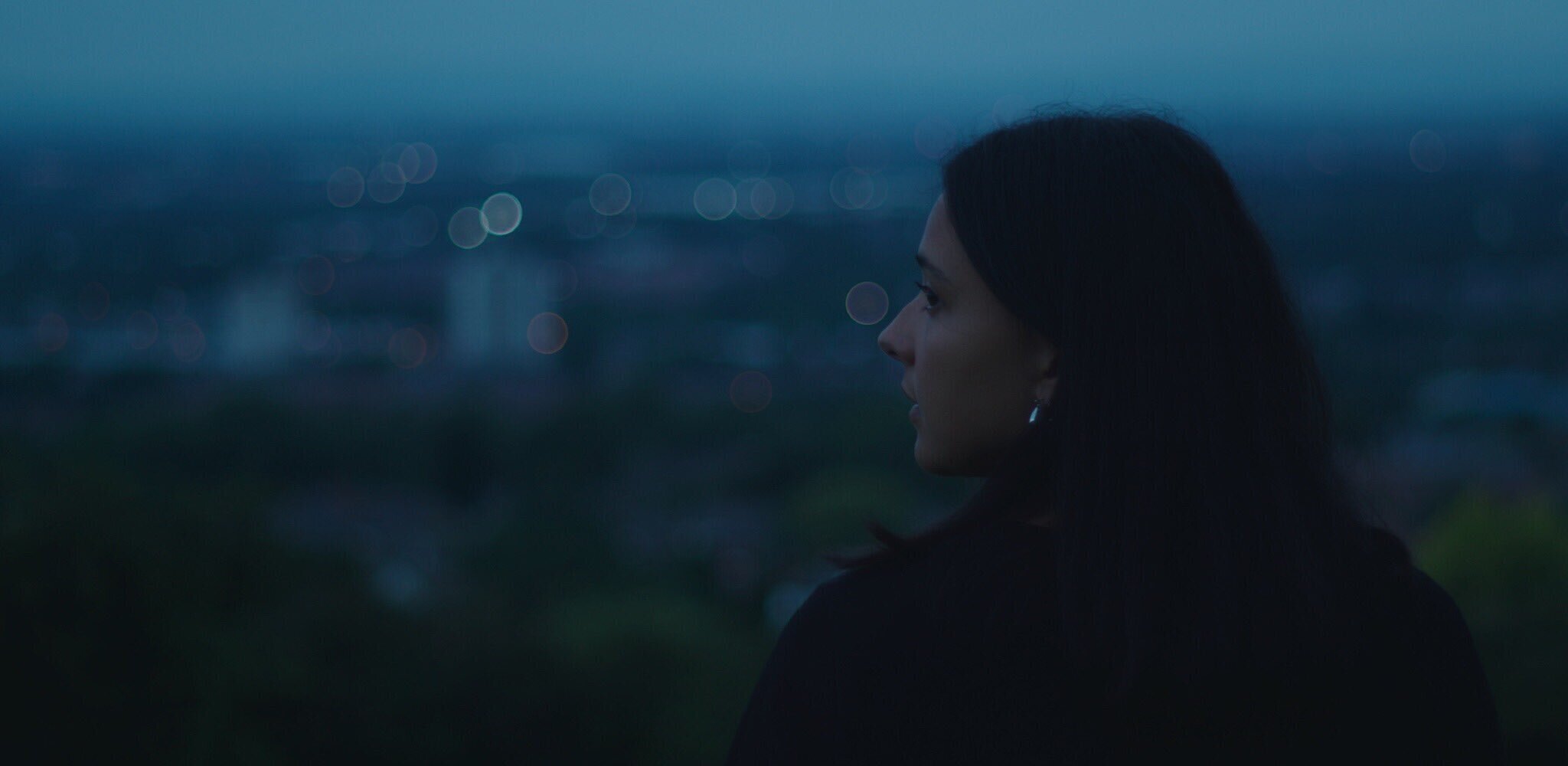
Colour Theory in filmmaking is paramount. Its importance cannot be overstated in helping quickly dictate to an audience the mood, tone and motivation of what they are watching. A specific colour scheme for a character can easily inform viewers about whether we should be trusting or distrusting of their intentions and how we should feel about them in that moment. A scene bathed in red tones could mean that danger abounds and we should proceed with caution. Or in the context of the film, it could add a deeply romantic flourish to the relationships we are seeing develop. It has been a vital part of storytelling in cinema and television since its introduction. So my question is - why is this element largely ignored in online video work?
Often online work can have a drab, flat look to it where colours just don’t pop or stand out. This isn’t to say that films always need to have a highly saturated look. A stylised, desaturated look can often help form a key part of the visual “dictionary” of a docu-series or portrait project. But often video projects online tend to have a muted colour palette which seems to be more a result of an indifferent and muddled colour grade than a stylised choice. Furthermore, there’s little care given to the choices of colour present within a scene - whether this be an interview, some office b-roll or a dramatic two-hander. None of this is new - colour theory was redefined by Isaac Newton in the early 18th Century and can be traced back as early as Aristotle.
The question is - why should you, as someone looking to employ a videographer or production team, give so much credence to the impact of colour? Well, for starters colour has both a conscious and subconscious impact on us all. In our every day life it stimulates and motivates us. Successful advertising works to utilise the psychology of colour to sell both brands and products. It makes films more eye catching and visually engaging and allows the filmmaker to deliver even more information to your watching viewers.
As a company, great care is taken in forging your brand colours and identity and your films should reflect this - what’s more, your brand colour can even be seamlessly woven into your film content, ensuring that your marketing collateral has a uniform look and feel across the board. This is important - “brand unity is key to projecting a whole and undivided corporate vision to your customers.” With the outbreak of Covid and subsequent lockdowns, user generated content has become more prevalent. In fact, some production companies have even offered out handy tips and advice on how best to self-shoot - lighting, composition, delivery. Yet still, the subject of colour is barely touched on in these briefs.
Often when we deliver our films, one of the pieces of feedback we get is how great the colours are - how they pop but also how they seem to fit the mood of the moment or piece. Whether that be creating moody blues to highlight a characters low-point, or just giving the film a clean, fresh look for a scientific instructional film. We shoot all of our film content in LOG, which means that in post-production we have the flatest picture profile possible to be able to manipulate and add colour back in. Ahead of a shoot we take on location scouts to scope out the look of a location, which we then use to develop a colour scheme for your movie, illustrated through our bespoke mood boards and storyboards. All of this is in service of creating a film that feels like you from top to bottom and that creates maximum audience engagement. We’re not saying that all promotional films should have the distinct visual palette of a Wes Anderson film - and yet, relative to you, why can’t they?
Don’t believe us? Next time you’re watching adverts on TV or they pop up online, take note of the ones that truly stand out to you and see how they’ve utilising colour. And then give us a call or email us to start a conversation and see how we can do the same for you.


